Scroll ↓
Shivani Singh · Food · Beauty · Events
Design you can almost taste.
A graphic designer for the brands people eat, wear and celebrate — plus the client work that proves I can carry any brand’s story.
- On the fork
- Rigatoni
- Sun-dried tomato
- Basil
- Burrata
- Olive oil
- Cracked pepper
Scroll to plate the bite ↓Plated — keep scrolling ↓
Passion project · rigatoni, burrata & basil still life
Passion project — P1
Self-initiated
Food & drink, plated for the scroll
Concepts I make for restaurants, bakeries and takeaway brands: the props, the colour and the type are chosen together, so a single frame can stop a thumb mid-feed and still read as a menu, a poster or a launch post.
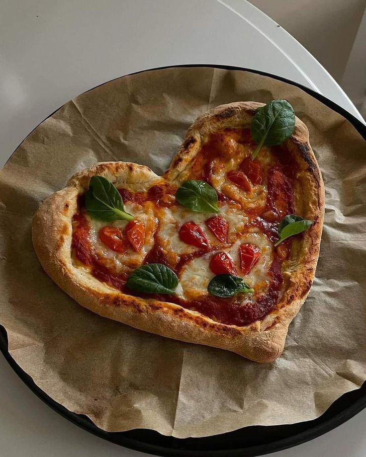
Heart margherita
A Valentine’s special that needs no headline — the shape says it.
Menu feature · social post 4:5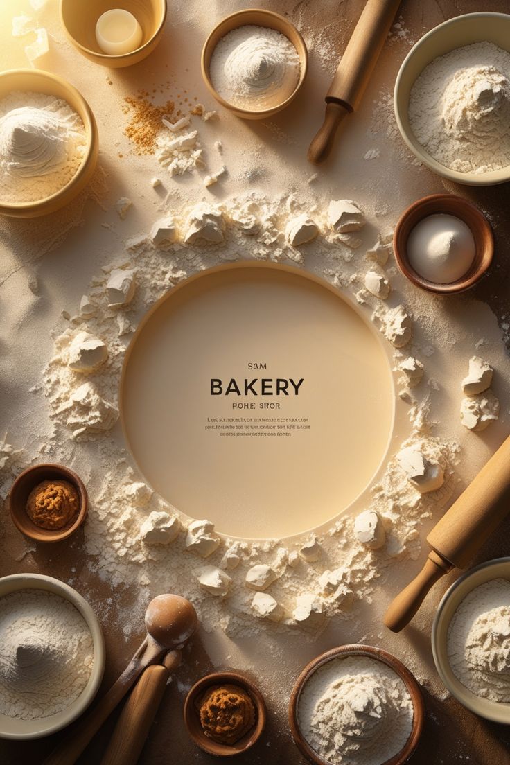
The flour ring
An opening poster where the ingredients frame the name.
Bakery launch · poster & story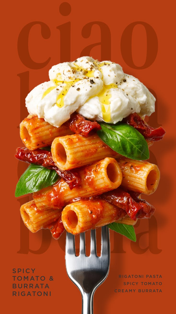
Spicy tomato & burrata rigatoni
The dish stacked on a fork, set over oversized type — a menu poster that reads as a still life.
Menu poster · story 9:16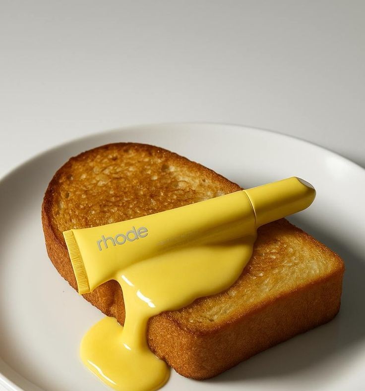
Passion project — P2
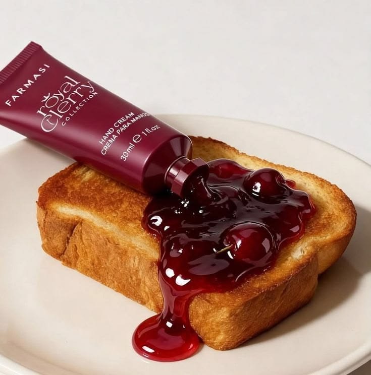
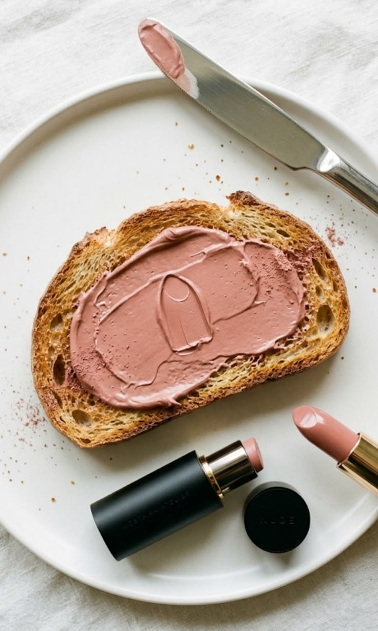
Beauty, served for breakfast
A still-life series where makeup is styled as the spread on morning toast — the texture of the product sells before anyone reads the name. Pick a shade to change the plate.
Move your cursor — lay thick paint on the canvas
After Vincent van Gogh, The Starry Night, 1889 · public domain
Portfolio · Graphic design · Digital marketing · Web
Work you canopen, flip& scroll.
I'm Shivani Singh — a graphic designer and digital marketer. I take a brand's story and carry it across packaging, print, web and email, whatever the brand. This is selected work from my previous roles.
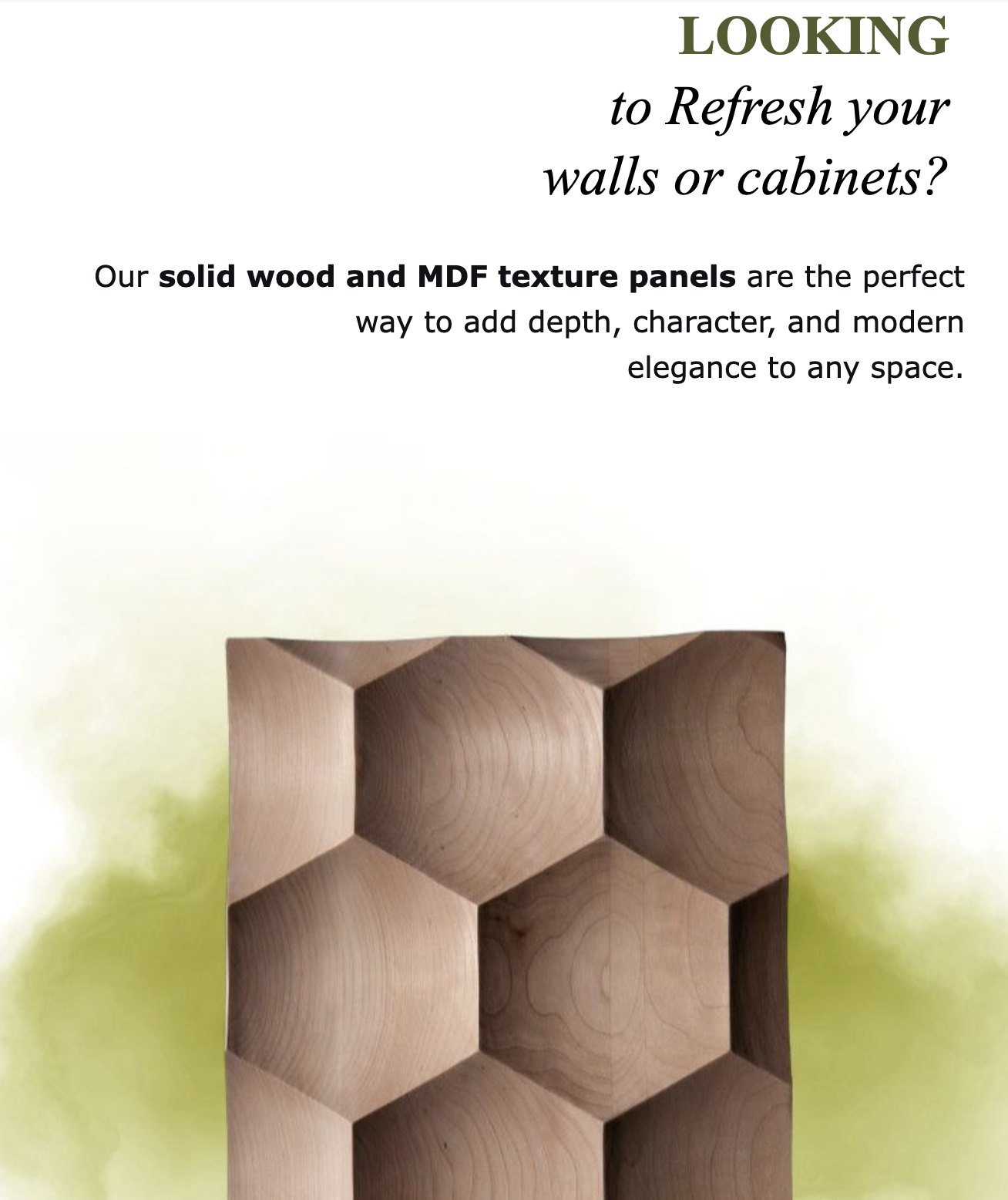
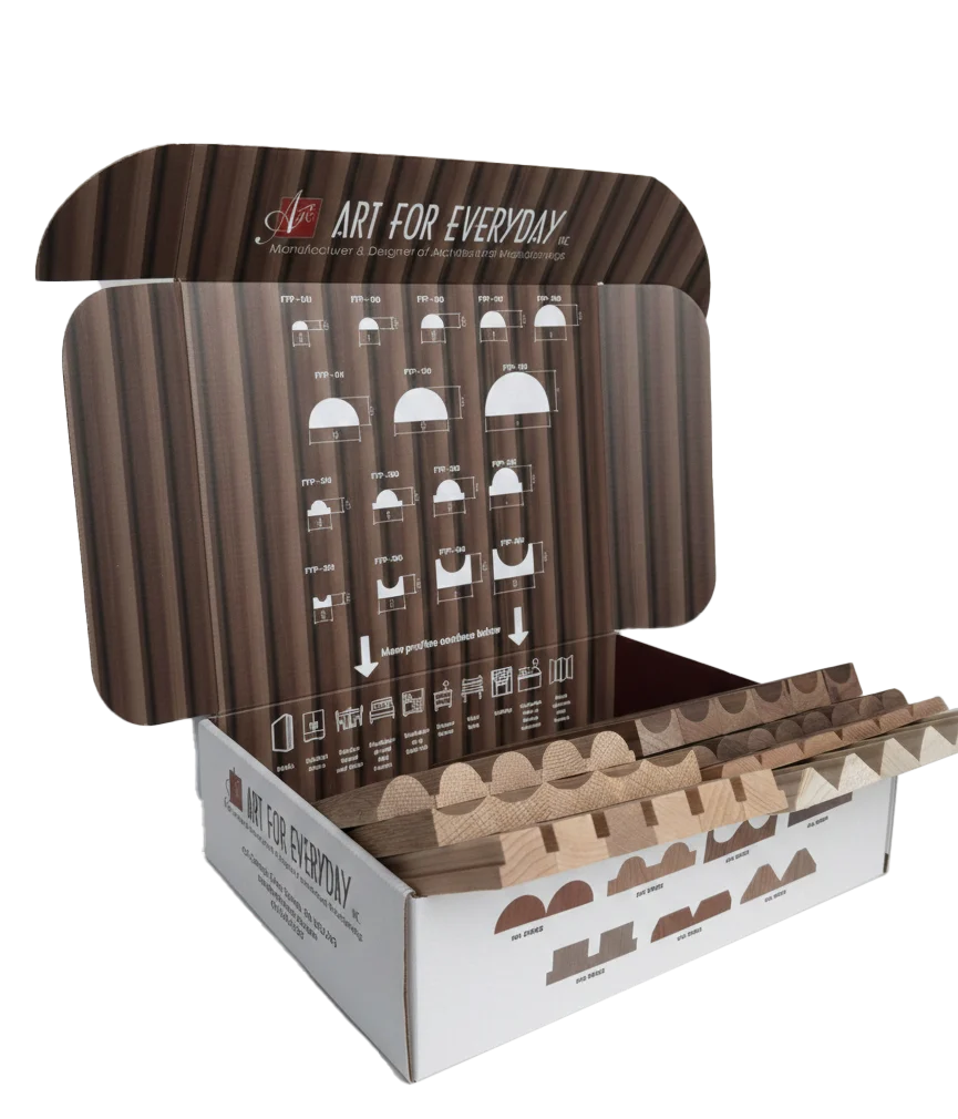
Selected work — 01
Precision & tradition, on every channel
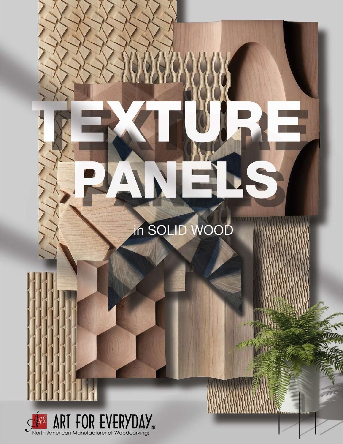
For Art For Everyday Inc., a manufacturer of solid-wood architectural components, the story had two halves that had to travel together: the technical detail designers and millworkers need to specify a product, and the hand-carving tradition behind every piece. I carried both into each channel, so a customer meets the same brand in the box, on the page, on the screen and in the inbox.
{{r.tech}}
{{r.craft}}
Case study — 02
The tambour sample kit
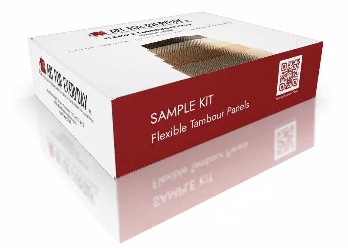
A designer-first sample kit for Flexible Tambour Panels in solid wood — taken from competitor research to a finished, locally produced box.
Project overview
Competitor research showed that no one was giving designers an interactive way to experience the product — or the value of the brand behind it.
So I proposed a mailer-box sample kit, sized to fit the samples produced in our shop, and designed the entire box. I then sourced a local, budget-efficient box supplier and manufacturer and managed everything behind the box through production. The kit lets customers judge the quality of the wood with their own hands, which helped them understand the product better and supported sales.
- ClientArt For Everyday Inc.
- ProductFlexible Tambour Panels in solid wood
- ChallengeCompetitors offered no interactive, designer-focused way to experience the product and the brand's value.
- ResearchCompetitor review of how wood panel products are presented to designers.
- SolutionA mailer box sized to the shop's samples, with a profile chart printed inside the lid, product series on the inner walls, a companion booklet and real solid-wood samples.
- My roleConcept, full packaging design, supplier sourcing and production management
- SourcingLocal, budget-efficient box supplier and manufacturer
- Messaging on packCut-to-Size · Delivery 2–4 Weeks · 35+ Profiles with Custom Capabilities · Available in 20+ Wood Species and MDF
- ImpactCustomers could assess product quality first-hand, which helped them understand the product and supported sales.
- Launched with“Your Wood Tambour Sample Kit Is Waiting” ↗
Case study — 03
Texture Panels catalogue
A 20-page catalogue that puts one of Art For Everyday's best-selling products in front of designers and millworkers — with the technical detail they need to specify it. Turn the pages: click a page, use the arrow keys, or pick a page below.
Trade shows needed distribution material that keeps selling after the conversation ends.
I worked with the CAD designers to produce precise 2D drawings of every panel, chose the panel angles that show each texture at its best, and built one page system around them: full-bleed texture on the left, a spec column on the right, and the process that connects CNC precision to hand finishing.
- AudienceDesigners and millworkers
- PurposeTrade-show distribution material for a best-selling product line
- CollaborationCAD designers — accurate 2D profile drawings for each panel
- StructureCover · wood species (14 + HDF) · four-step process · panels A–O (PNL-TXA → PNL-TXO) with profile drawings · inspiration gallery · custom panels · back cover with quote QR
- My roleDesigner
Case study — 04
artforeveryday.com
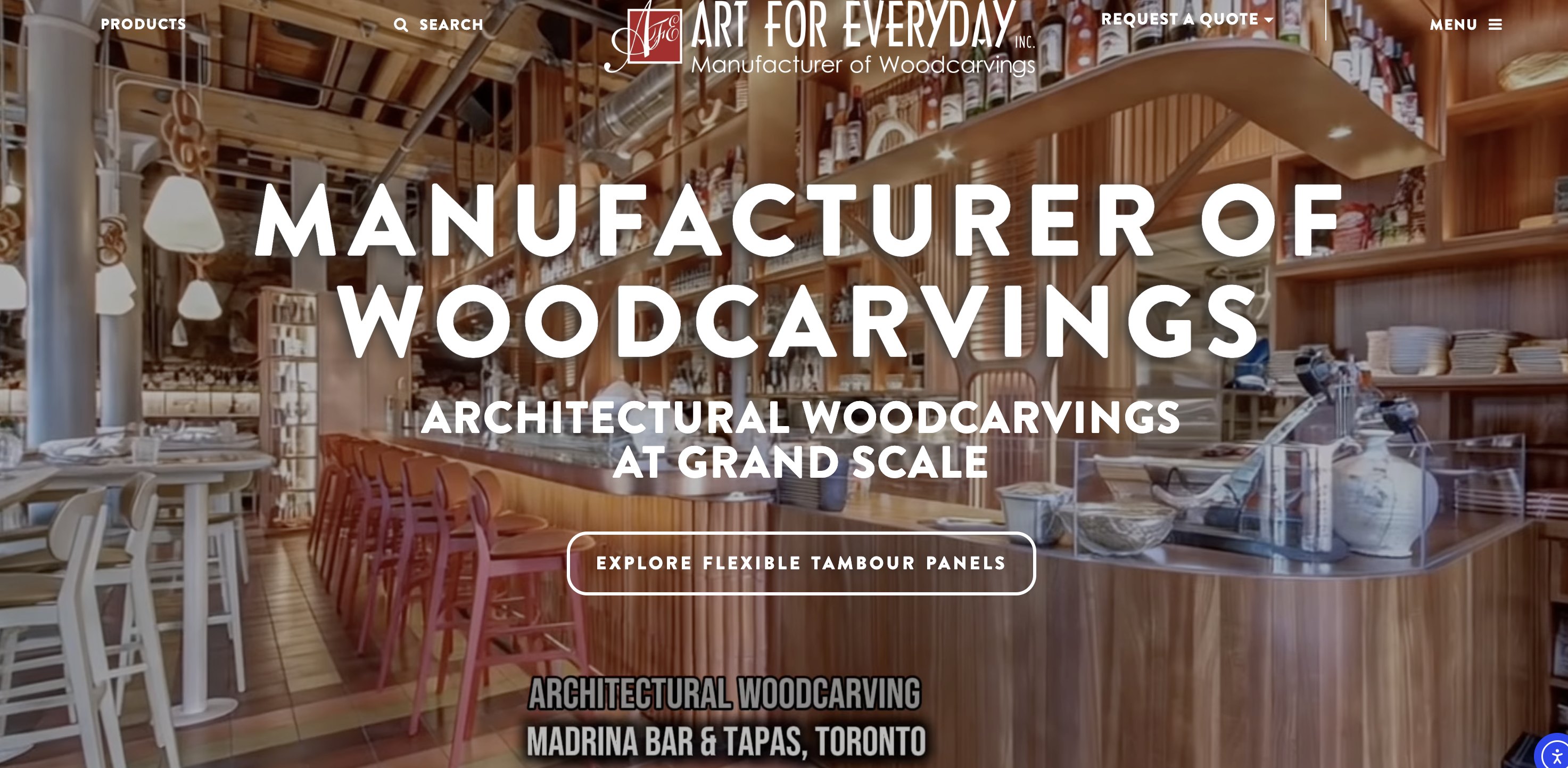
The previous homepage never showed the range of products and industries Art For Everyday serves, and it gave visitors little to engage with — few images, no interactive elements, nothing to hold attention at the first interaction. I redesigned the homepage and three service pages around imagery, variety and interaction.
Problem
The homepage hid the product range and the industries served, and lacked imagery and interaction.
Approach
Full-bleed project imagery, category and trade-segment sections, a visual process story and interactive elements from the first screen.
Role
Designer — homepage and three service pages
Screenshot — add file
{{web.h1}}Case study — 05
Campaigns in the inbox
Email marketing for Art For Everyday — product launches, the sample-kit offer and the year-end recap. Choose a campaign to preview it.
Full-length campaign capture — add file
{{mail.subject}}- {{o}}
Case study — 06
Print in the trade press
Full-page advertisements for Art For Everyday in the CMA's seasonal industry publications. Each piece is shown as the press-ready file — bleed, crop marks, registration marks and colour bars intact.
TrimBleed{{ad.guideNote}}
- Publication{{ad.pub}}
- FormatFull-page advertisement · trim {{ad.trim}}
- Print setup{{ad.setup}}
- On the page{{ad.els}}
Brochure · two-sided
You envision it. We make it.
Front — a hospitality interior leads into Flexible Tambour Panels: cut-to-size, 55+ profiles, 14+ wood species.
Back — the capability story: custom woodworking, design & 3D modelling, CNC machining (11 CNC machines, 3-, 4- and 5-axis), master-carving and commercial architectural millwork, with the WCMA membership mark. Both sides close on the same contact band and QR code.
{{broSide}} · click to flip
About — 07
Any brand. One story, told everywhere.
I work across content creation, SEO strategy, digital marketing, web management and design — and I make sure a brand reads the same in every one of them.
Graphic Designer with 3+ years of experience creating polished print and digital marketing materials across corporate, product and brand environments. Experienced in producing catalogs, advertisements, brochures, presentations, email graphics, website visuals and social media assets while maintaining brand consistency and strong design standards. Proficient in Adobe Creative Cloud, print-ready artwork preparation and production coordination, with the ability to manage projects from brief through final delivery while balancing multiple priorities and deadlines.
- ExperienceDigital Marketing Executive · Marketing Assistant
Toolkit
- {{t.name}}{{t.use}}